The St. Louis Blues logo evolution tells a story of identity, tradition, and subtle reinvention. Since its founding in 1967, the franchise has preserved the essence of the “Blue Note” while adjusting its look to match the era.
🏒 1967–1978: The Original Blue Note
The inaugural logo featured a light blue musical note with a distinctive wing on the stem’s right side, designed to convey motion and energy. While often remembered for its simplicity, this version also appeared on a shield design that included two crossed swords, stars, and “StL” in white lettering.
🔄 1978–1985: Bulkier Note and Wordmark
In 1978, the logo underwent a significant update. The note’s form became slightly bulkier, and a circular layout introduced “ST. LOUIS” above and “BLUES” below the emblem, offering a more defined brand identity.
🔴 1985–1998: Introducing Red and Refinement
This era added a splash of red that would stay for over a decade. The “St. Louis” and “Blues” wordmarks were repositioned around the note, creating a more symmetrical and visually balanced branding.
🔵 1998–2009: Modernizing the Look
In 1998, the logo underwent a streamline. The red outline was dropped, the blue shade darkened, and the “ST. LOUIS” wordmark was removed. The musical note stood alone, accented by yellow, white, and dark blue outlines, creating a bold and modern feel.
✨ 2009–Present: Sharper, Cleaner, Recognizably Blues
A slight redesign in 2009 brightened the blue and gave the note sharper edges, resulting in the version still seen today. Based heavily on the 1998 mark, it preserved the winged note concept while enhancing clarity and contrast.
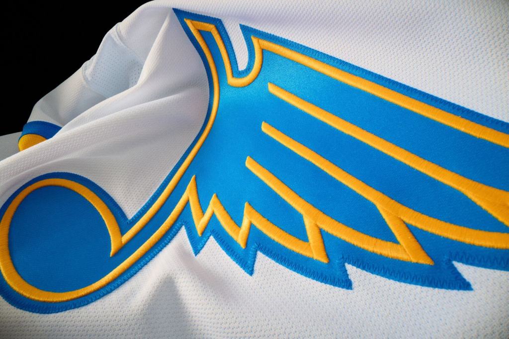
🎨 2025 Brand Evolution: A Nod to the Past with a Modern Twist
In 2025, the Blues revealed a refreshed Blue Note logo as part of a broader brand update. The latest version simplifies the color scheme to blue and yellow, thickens the lines, and subtly adjusts the note’s shape for visual impact.
The brand update was inspired by throwback jerseys, paying tribute to franchise history while embracing a modern aesthetic. Additional tertiary logos were also introduced, incorporating elements such as the Fleur-de-lis, the Gateway Arch, and the “STL” initials, thereby strengthening the connection to St. Louis and its musical heritage.